|
Size: 18821
Comment:
|
Size: 18980
Comment:
|
| Deletions are marked like this. | Additions are marked like this. |
| Line 7: | Line 7: |
| * [[#column-statistics|Column Statistics]] | |
| Line 20: | Line 19: |
| Choose whether you want to create a new file, or open an existing file. If creating a new file, choose the appropriate format for your data table. Note on the left navigation bar, there are multiple options (XY, column, grouped, etc). If you click on one of these, the main window describes the type of data to be entered, and also displays the format of the data table. There are then several radio buttons available for you to indicate the nature of the data you will enter. If you are unsure how the table should be formatted, you can choose one of the sample data sets to see an example of that format. When a sample data table is selected, there will be further information displayed about the sample data and step by step instructions for performing the selected analysis. | Choose whether you want to create a new file, or open an existing file. If creating a new file, you’ll need to choose the appropriate format for your data table. Note on the left navigation bar, there are multiple options (XY, column, grouped, etc). For each of these options, the main window describes the type of data to be entered, and also displays the format of the data table. The radio buttons on this page allow you to indicate the nature of the data to be entered. If you are unsure how the table should be formatted, you can choose one of the sample data sets to see various examples. When a sample data table is selected, there will be further information displayed about the sample data and step-by-step instructions for performing the selected analysis. |
| Line 25: | Line 24: |
| For now, set the parameters as in the figure above (“replicate values stacked into columns): this would be appropriate for an unpaired t-test where you will provide the individual data points. Your data table will look like the image below. [[attachment:Data Table empty.png|{{attachment:Data Table empty.png|attachment:Data Table empty.png|width="550"}}]] Next, [[TwoSamplesOneVariable#paired-t|Enter the Blood Pressure data from the Wiki]], placing each data set into a different column, starting with the left-most column. Label the columns (click header). Also, on the left sidebar, label the data table “e.g., “Blood Pressure”. Your data table should now look like the image below. [[attachment:Blood Pressure data table individ.png|{{attachment:Blood Pressure data table individ.png|attachment:Blood Pressure data table individ.png|width="550"}}]] There are several other things in this window to notice: * Sidebar: Folders that organize Data, Info, Results, etc. This is generally how you’ll move between different elements of your project. * “New”, “Analyze”, “Change” buttons along the top of the window. These work in concert with the folders in the sidebar. For example, if you’re in a data window, click “New” to add a new data table, or a new graph, etc. Click “Analyze” to choose an analysis to perform on the data table you’re in. Select one of the options under “Change” to change the format of the data table you’re in, insert a row of data, etc. Similarly, if you’re in the Graph function of Prism, you can add a new graph of a data set, and/or change the format of a graph already created. * Main Menus (at top). These provide many different options (eg., delete a graph, reorder sheets, open /create a different data file, etc). A subset of these options are duplicates of those given in the “New”, “Analyze”, “Change” menus described above. Move your cursor over the Main Menu options to see what’s available. NOTE: There are times you may want to enter data as mean, SD (or SEM), n. These options are given in the Data Table setup window. In the current example, if you select Change>Format Data Table, you could reformat the table to receive group statistics rather than individual data points. Just be careful when choosing this format: if you choose mean/SD format but enter mean/SEM data, your statistical calculations will be incorrect! |
For now, set the parameters as in the figure above (“replicate values stacked into columns): this would be appropriate for an unpaired t-test where individual data points are entered. The data table will look like the image below. {{attachment:2_ColumnDataWindow.png||width="800"}} Next, [[TwoSamplesOneVariable#paired-t|Enter the Blood Pressure data from the Wiki]], placing each data set into a different column, starting with the left-most column. If control data exist, put it in the first column, which will place it in the leftmost portion of any graph. The rationale here is that graphs (and tables) are read left to right, and baseline (control) information is the benchmark needed to interpret other experimental groups. Label the columns (click header). Also, on the left sidebar, label the data table “e.g., “Blood Pressure”. Save your data file (and do this regularly as you work). Your data table should now look like the image below. {{attachment:3_DataTable_entries.png||width="800"}} Note several other items in this window: * Sidebar: Folders that organize Data, Info, Results, etc. This is generally how you’ll move between different elements of your project. At the top is a folder labeled “Family”. This contains all components (data table, analyses, graphs) related to the data that you currently have selected. * “New”, “Analyze”, “Change” buttons along the top of the window. These work in concert with the folders in the sidebar. For example, if you’re in a data window, click “New” to add a new data table, or a new graph, etc. Click “Analyze” to choose an analysis to perform on the data table you’re in. Select one of the options under “Change” to change the format of the data table you’re in, insert a row of data, etc. Similarly, if you’re on a graph page, you can add a new graph of a data set, and/or change the format of a graph already created. A description of each function appears when the cursor hovers over an icon. * Main Menus (across top). These provide many different options (eg., delete a graph, reorder sheets, open/create a different data file, etc). Some of these options are duplicates of those given in the “New”, “Analyze”, “Change” menus described above. Move your cursor over the Main Menu options to see what’s available. NOTE: There are times you’ll want to enter data as mean, SD (or SEM), n. These options are given in the Data Table setup window. In the current example, if you select Change>Format Data Table, you could reformat the table to receive group statistics rather than individual data points. Just be careful when choosing this format: if you choose mean/SD format but enter mean/SEM data (or vice versa), your statistics will be incorrect! |
| Line 52: | Line 51: |
| {{attachment:Blood Pressure Graph_Initial.png|Blood Pressure Graph_Initial.png|height="229",width="242"}} For the Blood Pressure data entered in this tutorial, the default graph might looks like the figure above. You can modify the format by clicking on CHANGE>Graph type. You can modify virtually all other elements of the graph by clicking on the axis, text, etc, or by selecting an option available in the CHANGE menu. Don’t forget to label the Y axis appropriately for your dependent measure. NOTE: If you choose NEW>graph of existing data, you can create another graph of the data rather than modify the format of an existing graph. If you do this, you should title the graphs appropriately so you can differentiate one from another. |
{{attachment:4_BPgraph.png|height="229",width="242"}} For the Blood Pressure data entered in this tutorial, the default graph might looks like the figure above. You can modify the format by clicking on CHANGE>Graph type. You can modify virtually all other elements of the graph by clicking on the axis, text, etc, or by selecting an option available in the CHANGE menu. Don’t forget to appropriately label the Y axis. Note that if you choose NEW>graph of existing data, you can create another graph of the data rather than modify the format of an existing graph. If you do this, you should title the graphs appropriately so they are easily identified in the sidebar. |
| Line 61: | Line 60: |
| Once a Data Table is filled and labeled, click the “Analyze” button. The following window will appear: {{attachment:Analyze window_t.png|Analyze window_t.png}} | Once a Data Table is filled and labeled, click the “Analyze” button. The following window will appear: {{attachment:5_ttestAnalysisWind.png||height="455",width="493"}} |
| Line 65: | Line 64: |
| Next, the “Experimental Design” window will open so you can select the type of analysis to complete. For now, select unpaired, parametric test. Click OK. {{attachment:Parameters_unpaired t.png|Parameters_unpaired t.png}} Next, the “Options” window (shown below) will open : this allows you to set some further parameters. Most often, you would calculate a 2-tailed t-test. For now, we will ignore the other options. {{attachment:7_ttestOptionsWind.png}} |
Next, set the parameters for your analysis. First, the “Experimental Design” window will open for selecting the type of analysis to complete. For now, select unpaired, parametric test. Note that parametric tests assume equal variance between groups. If variance is not equal, nonparametric statistics should be chosen. {{attachment:6_ttestExpldesign.png||height="412",width="403"}} Next, click on “Options” (at the top of the window). Most often, you would use a 2-tailed test (make sure you understand why!). For “Report difference as”, make sure the order is left then right columns so as to avoid confusion. Finally, set the confidence level to 95% (e.g., p<.05). For now, ignore the other options (though you might want to select “Descriptive Statistics”, which will generate a secondary results page with some useful information). {{attachment:7_ttestOptionsWind.png||height="412",width="403"}} |
| Line 76: | Line 75: |
| You should now see the tabular results (shown below) of the analysis selected. This window describes which data table was analyzed, what type of analysis was run, and the results of that analysis. Note that in this example, t=0.4542, df=18. The p = .6551, therefore the means are not significantly different from one another. Some additional statistics are also reported, including means +/- SEM, and the results of an F test to compare whether the variance in the two groups differ significantly (if they do, a nonparametric t-test should instead be run by going to the CHANGE tab and choosing a nonparametric test) {{attachment:Blood Pressure Results_unpaired t.png|Blood Pressure Results_unpaired t.png|width="800"}} NOTE: If you realize that a paired t-test should have been used, this is easily corrected. Be sure you’re in the Analysis window; click on CHANGE. The Analysis Parameters box will reopen, and you can change to a paired t-test. The results window will now specify that the statistics reported are for a paired t-test. If you do this for the Blood Pressure Data, the results will now yield t=2.024, df = 9. The p=.0737, a value that approaches statistical significance (and is MUCH smaller than that obtained from an unpaired t-test). <<Anchor(column-statistics)>> == Column Statistics == ''__Description:__ ''Column statistics give a basic set of descriptive statistics (mean, median, standard deviation, etc.) for a set of data. It is usually a good idea to obtain column statistics for each data set since it can facilitate spotting mistakes in your data entry. Column statistics can be obtained for most data table formats. However, note that for an XY graph, column statistics will only be given for the Y variable. From the data table, choose >ANALYZE>Statistical Analysis>Column Statistics. Select the particular statistics you want calculated. Click OK. {{attachment:Select Parameters_Column Stats.png|Select Parameters_Column Stats.png}} |
You should now see the tabular results (shown below) of the analysis selected. This window describes which data table was analyzed, what type of analysis was run, and the results of that analysis. Note that in this example, t=0.4542, df=18. The p = .6551, therefore the means are NOT significantly different from one another. Some additional statistics are also reported, including means +/- SEM. Always check these values against your original data set (usually from an Excel spreadsheet) to catch any errors in data entry. Also shown in the analysis window are the results of an F test to compare whether the variance in the two groups differs significantly. If the variance is significantly different between groups, a nonparametric test should be used. To do this, click on the blue text at the top of the results window (it now shows “Unpaired t-test with equal SD”). This will reopen the Parameters window so you can choose a nonparametric test (under the experimental design tab). {{attachment:8_ttestResutls.png||height="543",width="548"}} NOTE: If you realize that a paired t-test should have been used, this is easily corrected. Click on the blue text that tells you what test results are being displayed (or click on CHANGE>Analysis Parameters up in the top menus); choose the Experimental Design tab, and then select a paired t-test. The results window will now specify that the results reflect a paired t-test. If you do this for the Blood Pressure Data, you’ll find t=2.024, df = 9. The p=.0737, a value that approaches statistical significance (and is MUCH smaller than that obtained from an unpaired t-test). The results window also shows a statistically significant effect of pairing. Finally, for a paired t-test, the data are best depicted by a line graph that shows the paired values (see below). Go to the Blood Pressure graph, and use the “Change” function to make that change. {{attachment:9_BPgraphPaired.png|height="229",width="242"}} |
| Line 98: | Line 86: |
| ''__Description:__ '' A one-way ANOVA compares the means (or medians, if nonparametric) of three or more groups that differ on only one dimension (independent variable). The test determines if there is a significant main effect of that variable. In order to determine which groups differ, you must perform post-hoc t-tests. '''Table setup: ''' . __Format of data table:__ ''X Column'': None. ''Y Column'': A single column of values OR, means +/- SEM (or SD), n. Remember, you can select the “Change” button to alter the format. '''OR''' __Type of graph:__ . Select the “One grouping variable” tab. . Select the middle graph in the top row (Column bar, vertical). |
''__Description:__ '' A one-way ANOVA compares the means (or medians, if nonparametric) of three or more groups that differ on only one dimension (the independent variable). The test determines if there is a significant main effect of that variable. In order to determine which groups differ, you must perform post-hoc t-tests. '''Data Table setup: ''' * Click “New > New Data Table (+ graph)", and then select COLUMN format and choose the format for the data. For this next example, the data are not repeated measures, so select “Enter replicate values, stacked into columns” (as shown below). Note that data instead could be entered as means/SEM (or SD)/N. Click OK. {{attachment:11_1wayNewDataTable.png||height="450",width="525"}} * [[Enter the TV watching data from the Wiki]]. * Label the Data table (e.g., TV watching) and check the graph that was created. If necessary, change the graph format and fix all labels. |
| Line 111: | Line 101: |
| * Under ''Analysis'' select “Built-in analysis.” (In the graph below, ANOVA is one of the recently used tests. Thus, we can find it in that category as well.) * Under ''Type'' select “Statistical analyses.” * Select “One-way ANOVA (and nonparametric).” * Under ''Data to analyze'' select “All data sets.” Click OK. {{attachment:Analyze Window_Anova.png|Analyze Window_Anova.png}} Next you will be prompted with an Analysis Parameters box. {{attachment:Parameters_1-way.png}} Normally you will use the default selections under ''Choose Test'', but if you are performing a repeated measures test or if the data is not Gaussian, be sure to check the appropriate boxes. If you want post-hoc t-tests, select the appropriate choice under ''Post test'' (the Tukey or Bonferroni post-hoc tests are used most often). Click OK. |
* Under ''Built-in Analysis'' choose “Column analysis”: "One-way ANOVA (and nonparametric". * In the right panel, make sure all data sets are selected. Click OK. * In the Parameters window that opens (see below), choose the appropriate experimental design. For the current data set, you should select no matching, and assume a Gaussian distribution. * Next, click on the Multiple Comparisons tab and select the appropriate comparison. For the TV watching data, there is no “control” group and no pre-selected pair of columns that’s particularly important, so the mean of each column should be compared to the mean of every other column. * Finally, click on the Options tab and make the appropriate selections. If multiple post-hoc comparisons are being made, correct the p value for multiple comparisons (this maintains p<.05 for the family of comparisons). Also select multiplicity adjusted p value to display the adjusted (*family-wise*) p value for each individual comparison. {{attachment:12_1wayExplDesign.png||height="430",width="426"}} * Click OK. |
| Line 128: | Line 117: |
| You should now see the tabular results (shown below) of the analysis selected. This window describes which data table was analyzed, what type of analysis was run, and the results of that analysis. Note that for the data on TV watching given in the Wiki, the overall F=.9188 and df = 2,12 (df for treatment=2, df for residual=12). The p = .4253, therefore there is no significant main effect of academic major on # TV hours watched per week. Also reported in this table are the results of Bartlett’s test, which evaluates whether there are significant differences in variance across groups (if there are, nonparametric statistics should be used – use the CHANGE tab to select a different test). The results of the posthoc tests are reported at the bottom of this page. In the present example, there are none of the posthoc comparisons are statistically significant. {{attachment:Results_Anova unmatched.png|Results_Anova unmatched.png|width="800"}} NOTE: If you realize that repeated measures ANOVA should have been used, this is easily corrected. Be sure you’re in the Analysis window; click on CHANGE. The Analysis Parameters box will reopen, and you can select repeated measures. The results window will now specify that the statistics reported are for a RM ANOVA. If you do this for the TV watching data, the results will now yield F=4.696, df = 2, 8 (df for treatment=2, df for residual = 8). The p=.0448, suggesting that a significant amount of the variance in the data can be accounted for by academic major. Posthoc t-tests reveal that NSC majors watch significantly more hours of TV/week than do “Other” (nonBCS/nonNSC) majors. Again, notice that the pairing (repeated measures) had a major effect on the outcome of this analysis. {{attachment:Results_Anova RM.png|Results_Anova RM.png|width="800"}} |
You should now see the tabular results (shown below) of the analysis selected. This window describes which data table was analyzed, what type of analysis was run, and the results of that analysis. Note that for the data on TV watching, the overall F=.9188 and df = 2,12 (df for treatment=2, df for residual=12). The p = .4253, therefore there is no significant main effect of academic major on # TV hours watched per week. Also reported in this table are the results of Bartlett’s test, which evaluates whether there are significant differences in variance across groups (if there are, nonparametric statistics should be used – use the CHANGE tab to select a different test). IMPORTANT: The results of the overall ANOVA don’t tell you which (if any) groups differ from one another; only posthoc tests can evaluate specific group differences. If multiple comparisons were selected from the Analysis parameter options, there will be a second page of results reporting those results (look for this in the sidebar). In the present example, none of the posthoc comparisons are statistically significant. {{attachment:13_1wayResults.png|Results_Anova unmatched.png|width="800"}} NOTE: If you realize that repeated measures ANOVA should have been used, this is easily corrected. From the ANOVA results page, click on the blue text that specifies which test was run (or, go to CHANGE> analysis parameters. The Analysis Parameters box will reopen, and in the Experimental Design tab you can select repeated measures. The results window will now specify that the statistics reported are from a RM ANOVA. |
| Line 139: | Line 128: |
| ''__Description:__'' A two-way ANOVA is used when the experimental design investigates the effects of two different independent variables (e.g. sex AND age). The test tells you if there is a significant main effect of each variable, and if there is a significant interaction between the two independent variables. '''Table setup:''' . There are many ways to set up a table for a two-way ANOVA. The easiest way, especially with large amounts of data, is to enter the data as mean/SD (or SEM)/n. To set up the data table in that format, do the following: . __Type of graph:__ . Select the “Two grouping variables” tab. . Select either the first (Interleaved bar, vertical) or third (Grouped bar, vertical) graph on the top row. (Note that there is a difference between the two, but it is hard to know which one you want before you see the graphs, so you can always revisit this screen to change the graph type). . At the bottom, select Mean, Standard Error (or SD), N . '''**Be sure to select the correct format : don’t’ chose SEM if you mean SD''' __Format of data table:__ . ''X Column'': Text. . ''Y Column'': Mean, Standard Error, N. . ''OR'' . Mean, Standard Deviation, N The method above will not enable a repeated measures analysis: for that you need to enter the individual data points. To do that, from the format window you’ll choose: . ''X Column'': Text. . ''Y Column'': # of samples (values) for each condition {{attachment:Format Table 2way.png|Format Table 2way.png}} Label the columns and rows, and enter the Spine Density data from the Wiki, placing each data set into the appropriate column and row. Also on the left sidebar, label the data table “e.g., “Spine Density: Treatment”. We’ve appended the name “treatment” to this because the format shown below will give posthocs for the effect of treatment (at each age). As explained below, you’ll need to create a different data table with the data reformatted to get posthocs for the effect of age (in each treatment group). For now, your data table should look like: {{attachment:Spine density data treatment.png|Spine density data treatment.png}} '''Analysis setup:''' * Once you have entered the data, click on the “Analyze” button. * Under Analysis select “Built-in analysis.” * Under Type select “Statistical analyses.” * Select “Two-way ANOVA.” * Under Data to analyze select “All data sets.” |
''__Description:__'' A two-way ANOVA is used when the experimental design investigates the effects of two different independent variables (e.g., sex AND age). The test reveals if there is a significant main effect of each variable, and if there is a significant interaction between the two independent variables. '''Data Table setup:''' * Click “New”>New Data Table (+ graph), and then select GROUPED format. Note that Column format is used for one grouping variable (t test or 1-way) while Grouped format is needed for two grouping variables (one defined by columns, the other by rows). {{attachment:14_2wayNewDataTable.png||height="450",width="525"}} There are many ways to set up a table for a two-way ANOVA. The easiest, especially with large amounts of data, is to enter the data as mean/SD (or SEM)/n (see third radio button option in the image above). CAUTION! Double-check your selection: if you choose mean/SD format but enter mean/SEM data (or vice versa), your statistical calculations will be incorrect! For the Spine Density data from the Wiki, the Data Table of means/SEM/n (after labeling rows and columns) should look as follows: {{attachment:15_2wayMeansDataTable.png||height="187",width="516"}} However, realize that data entry using summary statistics (such as mean, etc) does not permit a repeated measures analysis because summary data do not retain information about individual data points. If we assume the spine data are from repeated measures taken at 2 different ages (e.g., based on 2-photon imaging data), replicate measures need to be entered (in this case, 5 subjects in each treatment group) and the Data Table (after labeling rows and columns) should look as follows: {{attachment:16_2wayIndividDataTable.png||height="149",width="762"}} After creating the data table, be sure to label the table in the sidebar (e.g., Spine Density), and look at the graph that was created to be sure the format is optimized and all axes are labeled. '''Analysis setup (continue assuming repeated measures design:''' * Once data are entered, click on the ''Analyze'' button. * Under ''Built-in analysis'', choose ''Grouped analysis'', "Two-way ANOVA". * In right panel, make sure all data sets are selected. |
| Line 177: | Line 156: |
| * Next you will be prompted with an Analysis Parameters box. In this example, we are not performing a repeated measures analysis, so choose “NO MATCHING”. You should select to calculate Bonferroni post-hoc tests. Next, it is very important that you correctly name the variables entered in the columns (vertical) and rows (horizontal). * Click OK. {{attachment:Spine density analyze .png|Spine density analyze .png}} . __LIMITATIONS__: Prism will only compare columns (within rows) for the post-hoc tests. To do post-hoc tests within a column (across rows), you’ll need to reformat your data table (more about that below). |
{{attachment:17_2wayAnalysis.png||height="437",width="471"}} * Next, the "Experimental Design” window will open. Since each row represents a different age (repeated measures are stacked within a subcolumn), check that button. Provide labels for the columns and rows (eg, treatment and age). {{attachment:18.png||height="361",width="512"}} * Select the tab for Multiple Comparisons. Prism6 will not perform group comparisons across both columns and rows in a single step, so these have to be done sequentially (order is inconsequential). So, first select comparisons within each column (this will evaluate the effect of age within each treatment group). {{attachment:19_2wayMultComp.png||height="344",width="463"}} * Click on the Options tab and select to correct for multiple comparisons. |
| Line 186: | Line 173: |
| You should now see the tabular results (shown below) of the analysis selected. Note that for the data on spine density (given in the Wiki), there is a significant main effect of treatment (F(1,16) = 40..65, p<.0001), age (F(1,16) = 5.04, p<.05) and a significant interaction between these two variables (F (1,16) =6.782, p<.02). {{attachment:Spine density Results.png|Spine density Results.png}} |
Under the tabular results (shown below) you should find there is a significant interaction between age and treatment (F (1,8) =6.2, p<.05) and a main effect of treatment (F(1,8 = 44.8, =.0002), and an effect of age that approaches significance. {{attachment:20_2wayResults.png||width="850"}} |
| Line 192: | Line 179: |
| . __Main effects:__ these are calculated by collapsing across levels of one variable and then evaluating group differences between levels of the other variable. They should be reported as “ a significant main effect of XX…”, as written above. In the case of comparing spine density in 2 treatment groups across 2 ages, a significant main effect of age does not mean that both treatment groups experience a significant effect of age. That is, a main effect of age could be the results of: a significant effect of age in only one group, a significant effect of age in one group with a nonsignificant trend in the same direction for the other group, OR a significant effect of age in both groups. Because the main effects don’t provide details about individual group differences, it is best not to state anything about the direction of group differences when reporting main effects. Further details require information from the Posthoc tests. __Interaction:__ The interaction term means that the effect of one factor depends on the other factor. Again, the post-hoc tests will help you interpret this interaction. '''Posthoc tests:''' The results of the posthoc tests are reported at the bottom of the ANOVA results page. In the present example, they reveal that prenatal cocaine exposure results in a significant reduction in spine density that is evident at both 4 and 12 weeks of age (4 wks: t=2.67, p<.05; 12 wks: t=6.35, p<.001). {{attachment:Spine density posthoc1.png|Spine density posthoc1.png}} As shown above, the posthocs done in Prism only compare group differences between columns (in this case, between treatment groups). Since we would also want to know if there is a significant effect of the other factor (e.g., age) within each treatment group, we need to reformat the data table so that columns represent different ages, rows represent different treatment groups. '''Transposing the data: ''' . Go to the data table you want to transpose. Select “NEW”>”duplicate current sheet”. . From that new sheet, select “ANALYZE”>”Data manipulation “>Transpose X and Y . From the Parameters page, select: X values in transposed table = Column titles . Column titles in transposed = X values {{attachment:Analyze transpose.png|Analyze transpose.png}} {{attachment:Transpose Parameters.png|Transpose Parameters.png}} This makes a new sheet of the transposed data in the RESULTS folder. To get this into a data table that can be analyzed: * Copy all of the columns from the transposed results * Go to the “Copy of” data table that you created, and paste the copied data * CHECK THE NUMBERS and labels!; Rename Data table appropriately Now, if you analyze that data table with a 2-way ANOVA (make sure your labels for Columns and Rows for ANOVA Parameters are correct for this transformed data), you should get the other set of Posthocs at the bottom of the Results page (all main effects will be the same): {{attachment:Spine density posthoc2.png|Spine density posthoc2.png}} |
. __Interaction:__ The interaction term means that the effect of one factor depends on the other factor. A significant interaction makes it particularly difficult to interpret the main effects. For this reason, the presence of an interaction should be noted before describing any main effects. Post-hoc tests help explain what underlies a significant interaction term. . __Main effects:__ these are calculated by collapsing across levels of one variable and then evaluating group differences between levels of the other variable. They should be reported as “ a significant main effect of XX…”, as written above. Note that a significant main effect of one variable (eg,, treatment) does not mean that this effect is evident at both levels of the other variable (e.g, at both ages). That is, a main effect of treatment could be the results of: a significant effect of treatment at only one age, or, a significant effect of treatment at one age with a nonsignificant trend in the same direction for the other age group, OR a significant effect of age in both groups. Because the main effects don’t provide details about individual group differences, it is best not to state anything about the direction of group differences when reporting main effects. Further details require information from the posthoc tests. '''Posthoc tests:''' The results of the posthoc tests are reported on a separate results page. In the present example, they reveal that a significant developmental increase in spine density is evident in controls (t=3.3, p<.05) but not in cocaine-exposed animals (see below). {{attachment:21_2wayPosthocAge.png||width="850"}} To evaluate group differences at each age, you’ll need to change the analysis parameters (Click ''Change>Analysis Parameters>Multiple Comparisons'', and select ''compare each cell mean with the other cell mean in that row''. These results (see below) reveal that there is a significant group difference at the earliest age, and this difference is magnified with age (4 wks: t=2.7, p<.05; 12 wks: t=6.4, p<.0001). {{attachment:22_2wayPosthocTreatment.png||width="850"}} Taken together, the posthoc tests show that prenatal cocaine exposure prevents a developmental increase in spine density that normally occurs between 4-12 weeks of age, and results in a lower density of spines at both 4 and 12 weeks after birth. |
| Line 222: | Line 197: |
| Prism saves files in the .pzf format, which is meaningless to anything but Prism | Prism6 saves files in the .pzfx format, which is meaningless to anything but Prism. |
| Line 226: | Line 201: |
| * Click on a data table or results tab, go to '''File -> Export''' to export the data as a .txt file * Click on a graph, go to '''File -> Export''' to export the graph image as a PDF or TIF or other image format * Highlight the data you want and copy it into word or excel |
* lick on a data table or results tab, choose '''File -> Export''' to export the data as a .txt file * Click on a graph, choose '''File -> Export''' to export the graph as a PDF, TIF, or other image format * Highlight the data you want and copy it into Word or Excel |
Working with Prism 6.0
Basics: (t-test example)
Basics
When you launch Prism 6, you’ll see the following window:
Choose whether you want to create a new file, or open an existing file. If creating a new file, you’ll need to choose the appropriate format for your data table. Note on the left navigation bar, there are multiple options (XY, column, grouped, etc). For each of these options, the main window describes the type of data to be entered, and also displays the format of the data table. The radio buttons on this page allow you to indicate the nature of the data to be entered. If you are unsure how the table should be formatted, you can choose one of the sample data sets to see various examples. When a sample data table is selected, there will be further information displayed about the sample data and step-by-step instructions for performing the selected analysis.
Data table setup
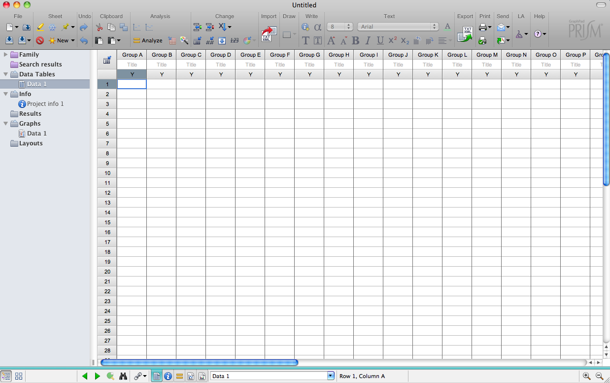
For now, set the parameters as in the figure above (“replicate values stacked into columns): this would be appropriate for an unpaired t-test where individual data points are entered.
The data table will look like the image below.
Next, Enter the Blood Pressure data from the Wiki, placing each data set into a different column, starting with the left-most column. If control data exist, put it in the first column, which will place it in the leftmost portion of any graph. The rationale here is that graphs (and tables) are read left to right, and baseline (control) information is the benchmark needed to interpret other experimental groups. Label the columns (click header). Also, on the left sidebar, label the data table “e.g., “Blood Pressure”. Save your data file (and do this regularly as you work).
Your data table should now look like the image below.
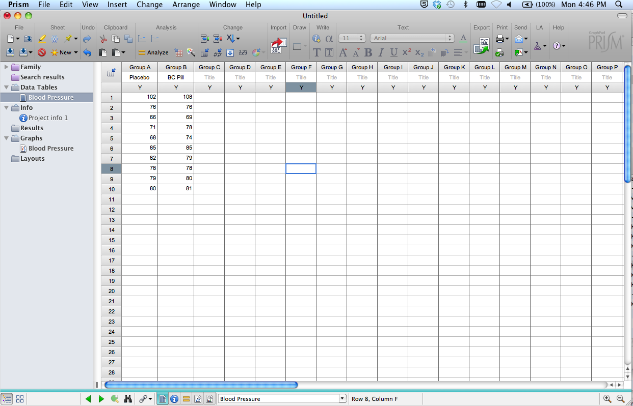
Note several other items in this window:
- Sidebar: Folders that organize Data, Info, Results, etc. This is generally how you’ll move between different elements of your project. At the top is a folder labeled “Family”. This contains all components (data table, analyses, graphs) related to the data that you currently have selected.
- “New”, “Analyze”, “Change” buttons along the top of the window. These work in concert with the folders in the sidebar. For example, if you’re in a data window, click “New” to add a new data table, or a new graph, etc. Click “Analyze” to choose an analysis to perform on the data table you’re in. Select one of the options under “Change” to change the format of the data table you’re in, insert a row of data, etc. Similarly, if you’re on a graph page, you can add a new graph of a data set, and/or change the format of a graph already created. A description of each function appears when the cursor hovers over an icon.
- Main Menus (across top). These provide many different options (eg., delete a graph, reorder sheets, open/create a different data file, etc). Some of these options are duplicates of those given in the “New”, “Analyze”, “Change” menus described above. Move your cursor over the Main Menu options to see what’s available.
NOTE: There are times you’ll want to enter data as mean, SD (or SEM), n. These options are given in the Data Table setup window. In the current example, if you select Change>Format Data Table, you could reformat the table to receive group statistics rather than individual data points. Just be careful when choosing this format: if you choose mean/SD format but enter mean/SEM data (or vice versa), your statistics will be incorrect!
Graphs
As soon as you create a data table, Prism also creates a graph.
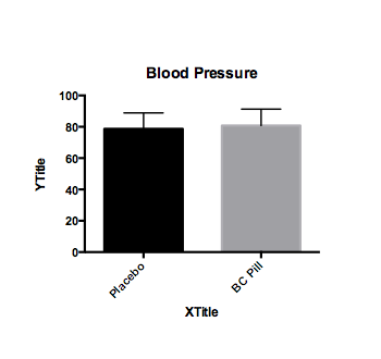
For the Blood Pressure data entered in this tutorial, the default graph might looks like the figure above. You can modify the format by clicking on CHANGE>Graph type. You can modify virtually all other elements of the graph by clicking on the axis, text, etc, or by selecting an option available in the CHANGE menu. Don’t forget to appropriately label the Y axis.
Note that if you choose NEW>graph of existing data, you can create another graph of the data rather than modify the format of an existing graph. If you do this, you should title the graphs appropriately so they are easily identified in the sidebar.
Analysis setup
Once a Data Table is filled and labeled, click the “Analyze” button. The following window will appear: 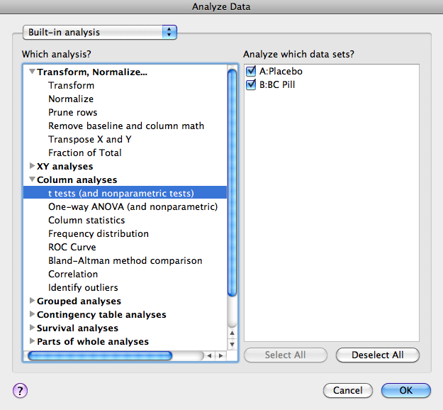
Under Column Analysis select “t-tests (and nonparametric tests).” Click OK.
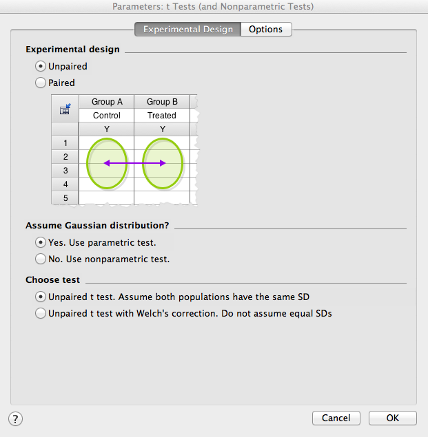
Next, set the parameters for your analysis. First, the “Experimental Design” window will open for selecting the type of analysis to complete. For now, select unpaired, parametric test. Note that parametric tests assume equal variance between groups. If variance is not equal, nonparametric statistics should be chosen.
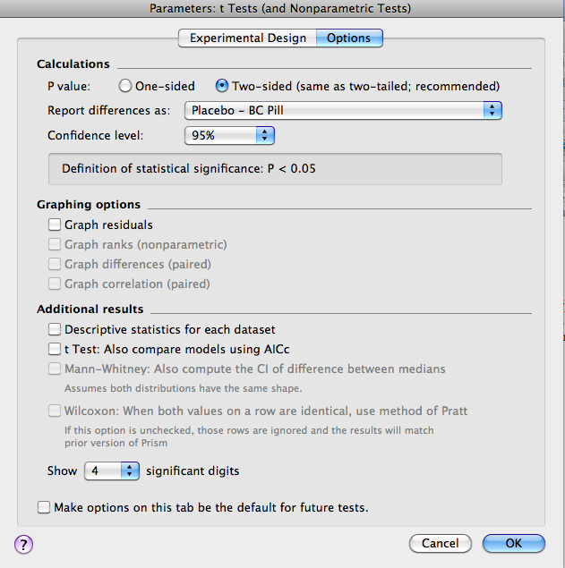
Next, click on “Options” (at the top of the window). Most often, you would use a 2-tailed test (make sure you understand why!). For “Report difference as”, make sure the order is left then right columns so as to avoid confusion. Finally, set the confidence level to 95% (e.g., p<.05). For now, ignore the other options (though you might want to select “Descriptive Statistics”, which will generate a secondary results page with some useful information).
Results
You should now see the tabular results (shown below) of the analysis selected. This window describes which data table was analyzed, what type of analysis was run, and the results of that analysis. Note that in this example, t=0.4542, df=18. The p = .6551, therefore the means are NOT significantly different from one another. Some additional statistics are also reported, including means +/- SEM. Always check these values against your original data set (usually from an Excel spreadsheet) to catch any errors in data entry. Also shown in the analysis window are the results of an F test to compare whether the variance in the two groups differs significantly. If the variance is significantly different between groups, a nonparametric test should be used. To do this, click on the blue text at the top of the results window (it now shows “Unpaired t-test with equal SD”). This will reopen the Parameters window so you can choose a nonparametric test (under the experimental design tab).
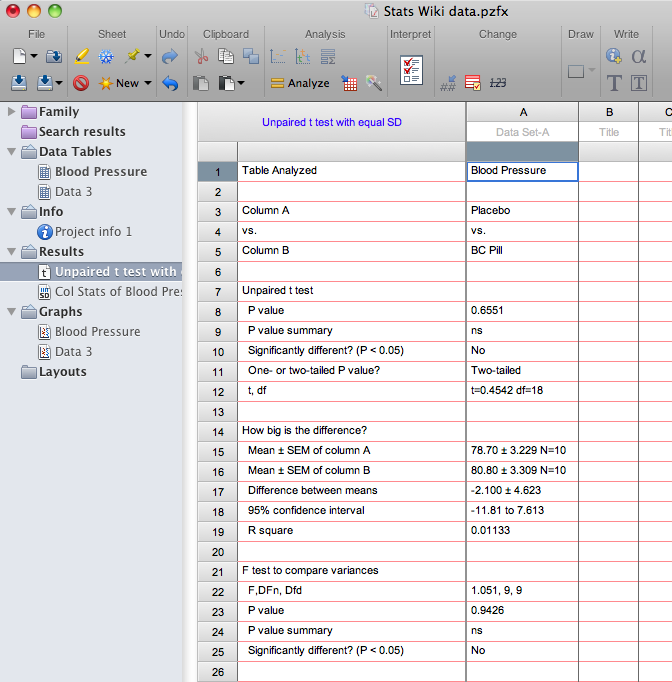
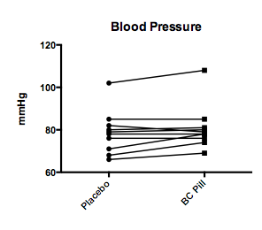
NOTE: If you realize that a paired t-test should have been used, this is easily corrected. Click on the blue text that tells you what test results are being displayed (or click on CHANGE>Analysis Parameters up in the top menus); choose the Experimental Design tab, and then select a paired t-test. The results window will now specify that the results reflect a paired t-test. If you do this for the Blood Pressure Data, you’ll find t=2.024, df = 9. The p=.0737, a value that approaches statistical significance (and is MUCH smaller than that obtained from an unpaired t-test). The results window also shows a statistically significant effect of pairing. Finally, for a paired t-test, the data are best depicted by a line graph that shows the paired values (see below). Go to the Blood Pressure graph, and use the “Change” function to make that change.
One-way ANOVA
Description: A one-way ANOVA compares the means (or medians, if nonparametric) of three or more groups that differ on only one dimension (the independent variable). The test determines if there is a significant main effect of that variable. In order to determine which groups differ, you must perform post-hoc t-tests.
Data Table setup:
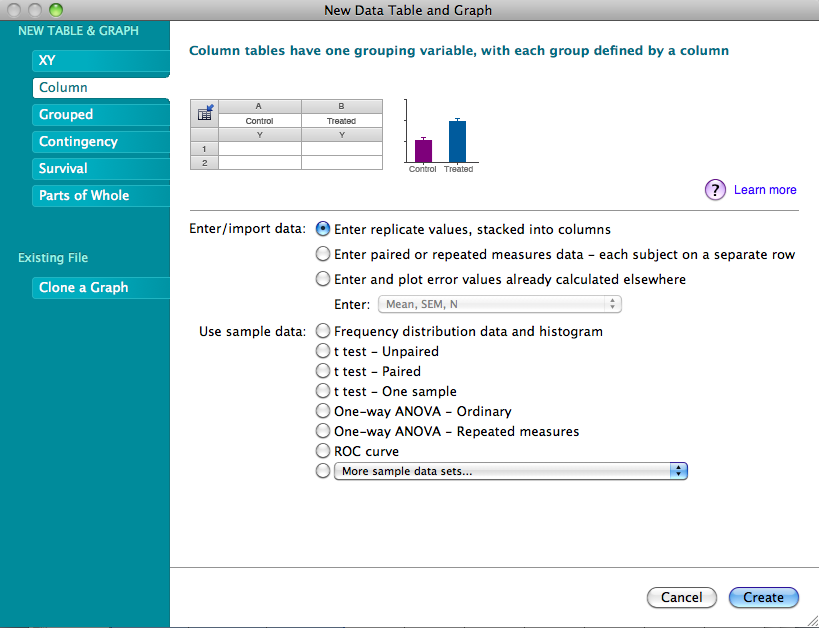
Click “New > New Data Table (+ graph)", and then select COLUMN format and choose the format for the data. For this next example, the data are not repeated measures, so select “Enter replicate values, stacked into columns” (as shown below). Note that data instead could be entered as means/SEM (or SD)/N. Click OK.
- Label the Data table (e.g., TV watching) and check the graph that was created. If necessary, change the graph format and fix all labels.
Analysis setup:
- Once data are entered, click on the “Analyze” button.
Under Built-in Analysis choose “Column analysis”: "One-way ANOVA (and nonparametric".
- In the right panel, make sure all data sets are selected. Click OK.
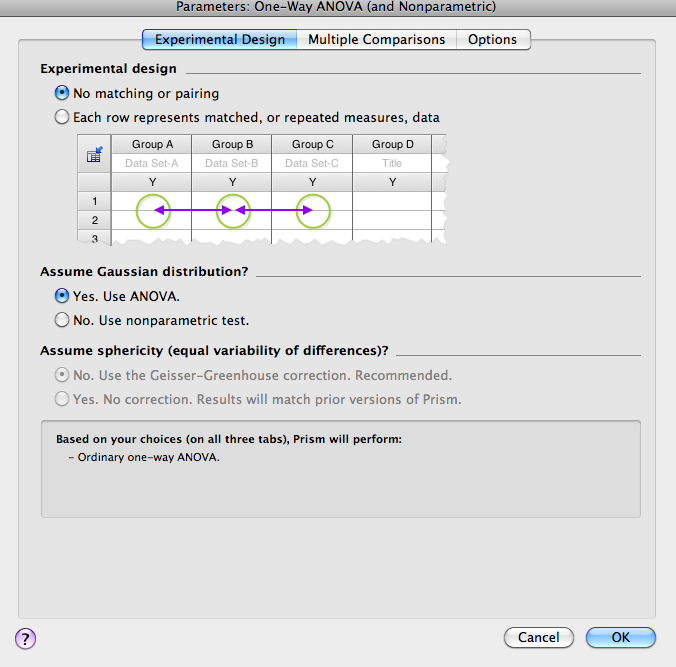
- In the Parameters window that opens (see below), choose the appropriate experimental design. For the current data set, you should select no matching, and assume a Gaussian distribution.
- Next, click on the Multiple Comparisons tab and select the appropriate comparison. For the TV watching data, there is no “control” group and no pre-selected pair of columns that’s particularly important, so the mean of each column should be compared to the mean of every other column.
Finally, click on the Options tab and make the appropriate selections. If multiple post-hoc comparisons are being made, correct the p value for multiple comparisons (this maintains p<.05 for the family of comparisons). Also select multiplicity adjusted p value to display the adjusted (*family-wise*) p value for each individual comparison.
- Click OK.
Results:
You should now see the tabular results (shown below) of the analysis selected. This window describes which data table was analyzed, what type of analysis was run, and the results of that analysis. Note that for the data on TV watching, the overall F=.9188 and df = 2,12 (df for treatment=2, df for residual=12). The p = .4253, therefore there is no significant main effect of academic major on # TV hours watched per week. Also reported in this table are the results of Bartlett’s test, which evaluates whether there are significant differences in variance across groups (if there are, nonparametric statistics should be used – use the CHANGE tab to select a different test). IMPORTANT: The results of the overall ANOVA don’t tell you which (if any) groups differ from one another; only posthoc tests can evaluate specific group differences. If multiple comparisons were selected from the Analysis parameter options, there will be a second page of results reporting those results (look for this in the sidebar). In the present example, none of the posthoc comparisons are statistically significant.
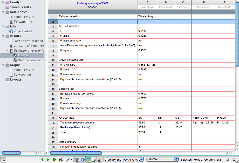
NOTE: If you realize that repeated measures ANOVA should have been used, this is easily corrected. From the ANOVA results page, click on the blue text that specifies which test was run (or, go to CHANGE> analysis parameters. The Analysis Parameters box will reopen, and in the Experimental Design tab you can select repeated measures. The results window will now specify that the statistics reported are from a RM ANOVA.
Two-way ANOVA
Description: A two-way ANOVA is used when the experimental design investigates the effects of two different independent variables (e.g., sex AND age). The test reveals if there is a significant main effect of each variable, and if there is a significant interaction between the two independent variables.
Data Table setup:
Click “New”>New Data Table (+ graph), and then select GROUPED format. Note that Column format is used for one grouping variable (t test or 1-way) while Grouped format is needed for two grouping variables (one defined by columns, the other by rows).
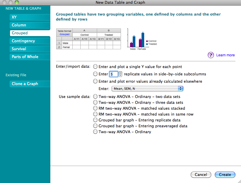
There are many ways to set up a table for a two-way ANOVA. The easiest, especially with large amounts of data, is to enter the data as mean/SD (or SEM)/n (see third radio button option in the image above). CAUTION! Double-check your selection: if you choose mean/SD format but enter mean/SEM data (or vice versa), your statistical calculations will be incorrect!
For the Spine Density data from the Wiki, the Data Table of means/SEM/n (after labeling rows and columns) should look as follows:
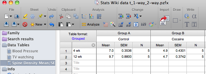
However, realize that data entry using summary statistics (such as mean, etc) does not permit a repeated measures analysis because summary data do not retain information about individual data points. If we assume the spine data are from repeated measures taken at 2 different ages (e.g., based on 2-photon imaging data), replicate measures need to be entered (in this case, 5 subjects in each treatment group) and the Data Table (after labeling rows and columns) should look as follows:

After creating the data table, be sure to label the table in the sidebar (e.g., Spine Density), and look at the graph that was created to be sure the format is optimized and all axes are labeled.
Analysis setup (continue assuming repeated measures design:
Once data are entered, click on the Analyze button.
Under Built-in analysis, choose Grouped analysis, "Two-way ANOVA".
- In right panel, make sure all data sets are selected.
- Click OK.
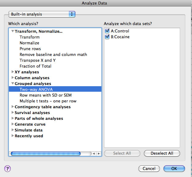
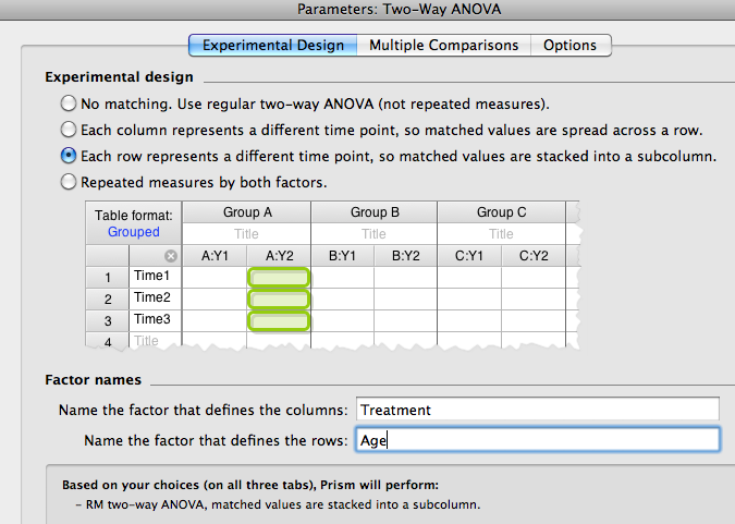
- Next, the "Experimental Design” window will open. Since each row represents a different age (repeated measures are stacked within a subcolumn), check that button. Provide labels for the columns and rows (eg, treatment and age).
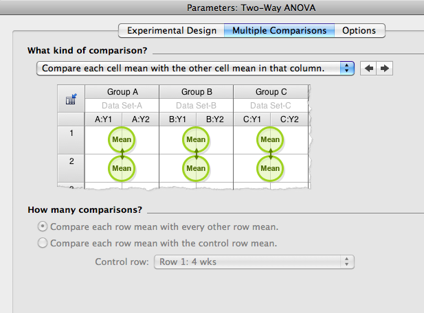
- Select the tab for Multiple Comparisons. Prism6 will not perform group comparisons across both columns and rows in a single step, so these have to be done sequentially (order is inconsequential). So, first select comparisons within each column (this will evaluate the effect of age within each treatment group).
- Click on the Options tab and select to correct for multiple comparisons.
Results:
Under the tabular results (shown below) you should find there is a significant interaction between age and treatment (F (1,8) =6.2, p<.05) and a main effect of treatment (F(1,8 = 44.8, =.0002), and an effect of age that approaches significance.
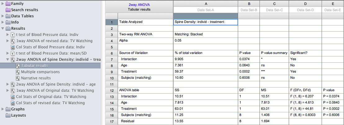
Interpreting two-way ANOVAs:
Interaction: The interaction term means that the effect of one factor depends on the other factor. A significant interaction makes it particularly difficult to interpret the main effects. For this reason, the presence of an interaction should be noted before describing any main effects. Post-hoc tests help explain what underlies a significant interaction term.
Main effects: these are calculated by collapsing across levels of one variable and then evaluating group differences between levels of the other variable. They should be reported as “ a significant main effect of XX…”, as written above. Note that a significant main effect of one variable (eg,, treatment) does not mean that this effect is evident at both levels of the other variable (e.g, at both ages). That is, a main effect of treatment could be the results of: a significant effect of treatment at only one age, or, a significant effect of treatment at one age with a nonsignificant trend in the same direction for the other age group, OR a significant effect of age in both groups. Because the main effects don’t provide details about individual group differences, it is best not to state anything about the direction of group differences when reporting main effects. Further details require information from the posthoc tests.
Posthoc tests: The results of the posthoc tests are reported on a separate results page. In the present example, they reveal that a significant developmental increase in spine density is evident in controls (t=3.3, p<.05) but not in cocaine-exposed animals (see below).
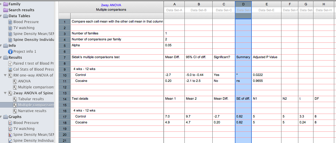
To evaluate group differences at each age, you’ll need to change the analysis parameters (Click Change>Analysis Parameters>Multiple Comparisons, and select compare each cell mean with the other cell mean in that row. These results (see below) reveal that there is a significant group difference at the earliest age, and this difference is magnified with age (4 wks: t=2.7, p<.05; 12 wks: t=6.4, p<.0001).

Taken together, the posthoc tests show that prenatal cocaine exposure prevents a developmental increase in spine density that normally occurs between 4-12 weeks of age, and results in a lower density of spines at both 4 and 12 weeks after birth.
Exporting Data/Graphs from Prism
Prism6 saves files in the .pzfx format, which is meaningless to anything but Prism.
There are several ways to get your files to a readable format elsewhere
lick on a data table or results tab, choose File -> Export to export the data as a .txt file
Click on a graph, choose File -> Export to export the graph as a PDF, TIF, or other image format
- Highlight the data you want and copy it into Word or Excel
- From any graph, copy and then paste into another document
- On macs, use command-shift-4 to take a screen shot. This turns your mouse into a cross hair. Click and drag to create a box around the area you want to capture, then release to take the shot. The image should appear on the desktop as a .png file, which is readable by most programs. If you capture your stats in this way, you won’t be able to edit them, but you can see the values you need.
