|
Size: 11377
Comment:
|
Size: 12434
Comment:
|
| Deletions are marked like this. | Additions are marked like this. |
| Line 11: | Line 11: |
| * Two-way ANOVA example | * [[#two-way|Two-way ANOVA example]] * [[#export|Exporting Data/Graphs from Prism]] |
| Line 88: | Line 89: |
| {{attachment:holder.png}} | {{attachment:Analyze window_t.png}} |
| Line 172: | Line 173: |
<<Anchor(export)>> == Exporting Data/Graphs from Prism == Prism saves files in the .pzf format, which is meaningless to anything but Prism There are several ways to get your files to a readable format elsewhere * Click on a data table or results tab, go to FileàExport to export the data as a .txt file * Click on a graph, go to FileàExport to export the graph image as a PDF or TIF or other image format * Highlight the data you want and copy it into word or excel * From any graph, copy and then paste into another document * On macs, use command-shift-4 to take a screen shot. This turns your mouse into a cross hair. Click and drag to create a box around the area you want to capture, then release to take the shot. The image should appear on the desktop as a .png file, which is readable by most programs. If you capture your stats in this way, you won’t be able to edit them, but you can see the values you need. [[FrontPage|Go back to the Homepage]] |
Working with Prism 4.0
Basics: (t-test example)
Basics
When you launch Prism 4, you’ll see one of the following windows (which one appears will depend on the settings of the last user).
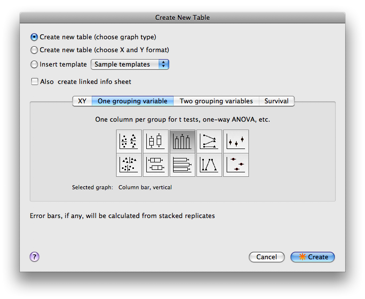
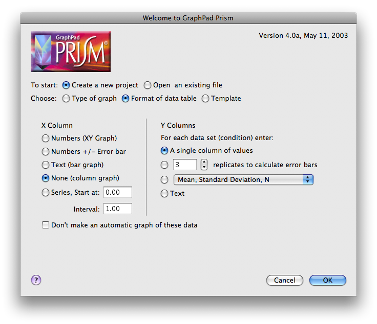
Choose whether you want to create a new file, or open an existing file. If creating a new file, you’ll next need to choose the appropriate format for your data table.
Data table setup
There are two methods for choosing the layout of the Data Table: 1) based on X and Y format (left window) or 2) based on Type of graph (right window). Use whichever method you find most intuitive. Note the button at the top that enables you to switch to the other method.
For now, set the parameters as in one of the figures above: this would be appropriate for a t-test where you want to input individual data points.
Format of data table:
X Column: None.
Y Column: A single column of values.
OR
Type of graph:
- Select the “One grouping variable” tab.
- Select the middle graph in the top row (Column bar, vertical).
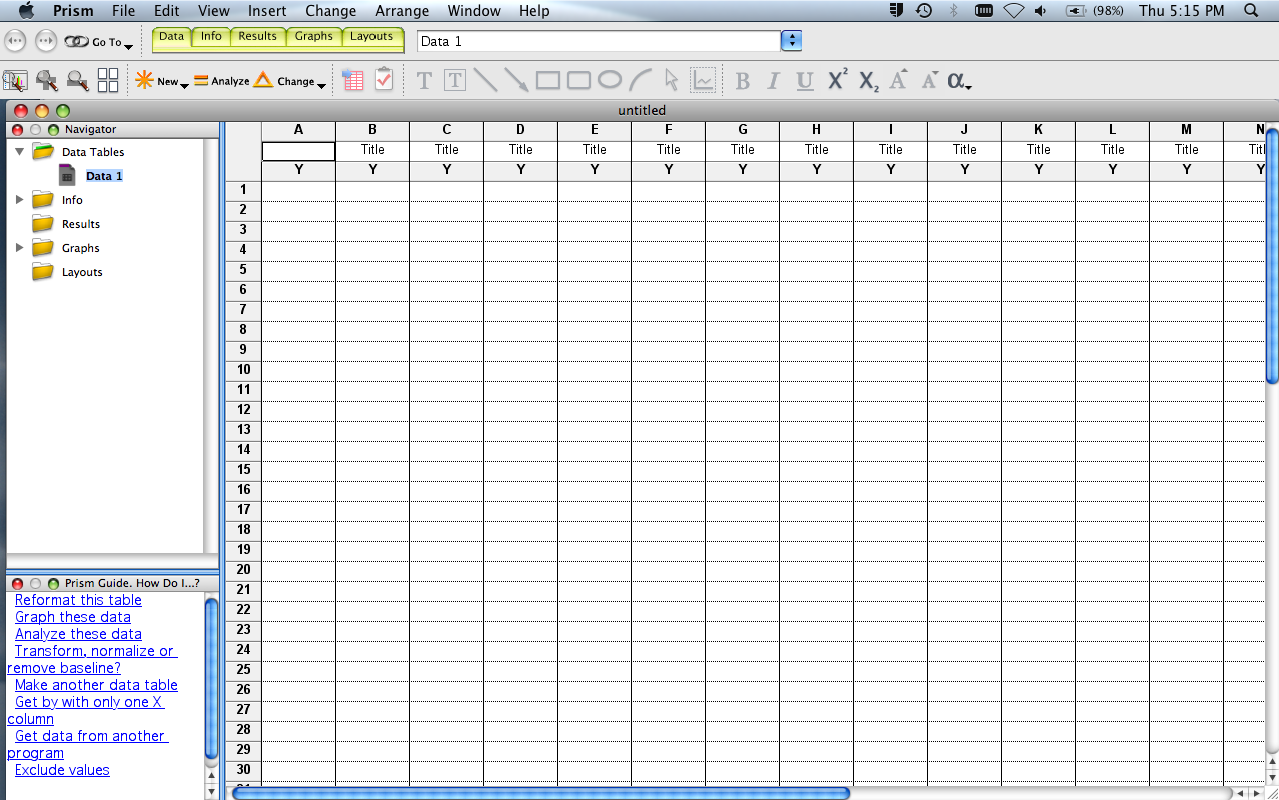
Your data table will look like the image below, left.
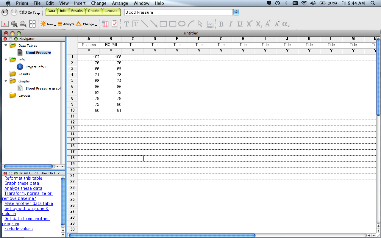
Enter the Blood Pressure data from the Wiki, placing each data set into a different column, starting with the left-most column. Label the columns (click header). Also on the left sidebar, label the data table “e.g., “Blood Pressure Data”.
There are several other things in this window to notice:
- Yellow Tabs (at top): to move between Data, Info (notes about experimental protocol, etc), Results (statistical analyses, curve fits, etc), Graphs, Layouts (options to organize multiple graphs).
- Sidebar: Folders that organize Data, Info, Results, etc. This is generally how you’ll move between different elements of your project. Note also that the bottom portion of the sidebar contains links to a Prism Guide - HELP tips for common functions.
- “New”, “Analyze”, “Change” buttons just above the table. These work in concert with the folders in the sidebar. For example, if you’re in a data window, click “New” to add a new data table. Click “Analyze” to choose an analysis to perform on the data table you’re in. Click “Change” to change the format of the data table you’re in. Similarly, if you’re in the Graph function of Prism, you can add a new graph of a data set, and/or change the format of a graph already created.
- Main Menus (at top). These provide many different options (eg., delete a graph, reorder sheets, open /create a different data file, etc). A subset of these options are duplicates of those given in the “New”, “Analyze”, “Change” menus described above. Move your cursor over the Main Menu options to see what’s available.
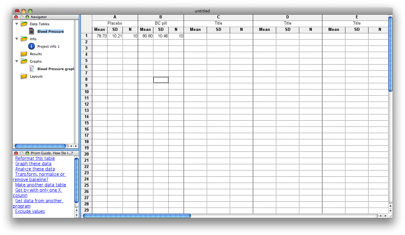
NOTE: There are times you may want to enter data as mean, SD (or SEM), n. These options are given in the Data Table setup window. In the current example, if you select Change>Format Data Table, you could reformat the table to receive group statistics rather than individual data points. The figure below shows the data window formatted for means/SD. Just be careful when choosing this format: if you choose mean/SD format but enter mean/SEM data, your statistical calculations will be incorrect!
Graphs
As soon as you create a data table, Prism also creates a graph.
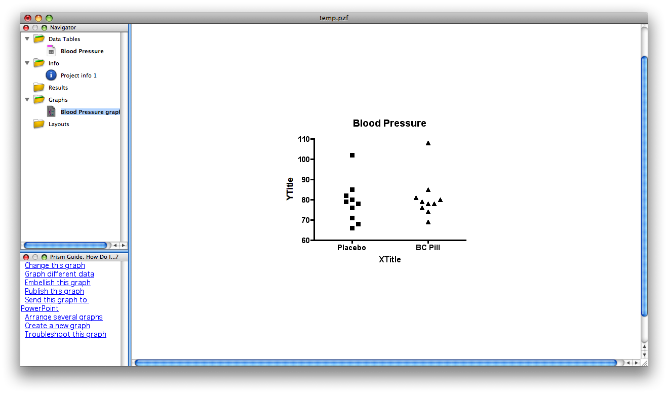
For the Blood Pressure data entered in this tutorial, the default graph might looks like the figure on above. Again, the particular form of the default graph (scatterplot, histogram, box/whisker, etc) depends on the prior user. You can modify the format by clicking on CHANGE>Graph type. You can modify virtually all other elements of the graph by clicking on the axis, text, etc, or by selecting an option available in the CHANGE menu.
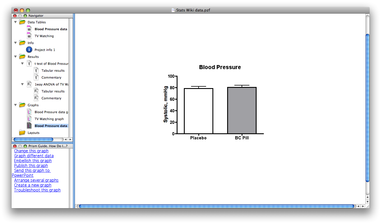
This is the same Blood Pressure data after making various changes in the graph format. In addition to plotting as histograms, note that the Y axis is now labeled appropriately and the fill/pattern in the bars has been changed, (just double click one of the bars, and a window will open to change various features).
Note that if you choose NEW>graph of existing data, you can create another graph of the data rather than modify the format of an existing graph. If you do this, you should title the graphs appropriately so you can differentiate one from another.
Analysis setup
Once a Data Table is filled and labeled, click the “Analyze” button. The following window will appear:
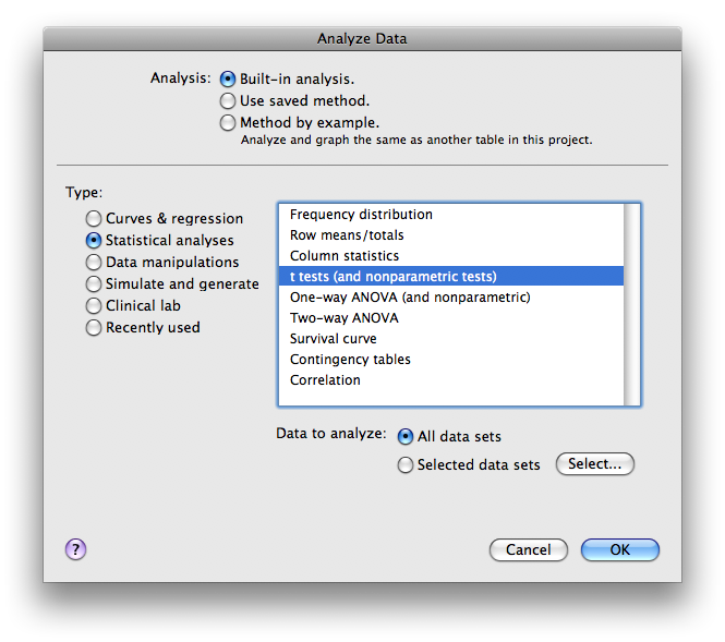
Under Analysis select “Built-in analysis.” Under Type select “Statistical analyses.” Select “t-tests (and nonparametric t tests).” Under Data to analyze select “All data sets.” Click OK.
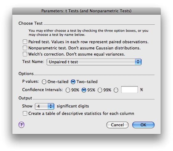
Next an Analysis Parameters box (shown below) allows you to select the statistics that you want calculated. For now, select unpaired, parametric t-test. Click OK.
Results
You should now see the tabular results (shown below) of the analysis selected. This window describes which data table was analyzed, what type of analysis was run, and the results of that analysis. Note that in this example, t=0.4542, df=18. The p = .6551, therefore the means are not significantly different from one another. Some additional statistics are also reported, including means +/- SEM, and the results of an F test to compare whether the variance in the two groups differ significantly (if they do, a nonparametric t-test should instead be run by going to the CHANGE tab and choosing a nonparametric test)
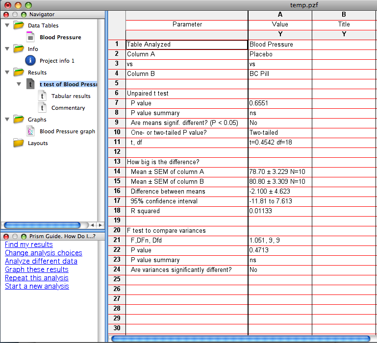
NOTE: If you realize that a paired t-test should have been used, this is easily corrected. Be sure you’re in the Analysis window; click on CHANGE. The Analysis Parameters box will reopen, and you can change to a paired t-test. The results window will now specify that the statistics reported are for a paired t-test. If you do this for the Blood Pressure Data, the results will now yield t=2.024, df = 9. The p=.0737, a value that approaches statistical significance (and is MUCH smaller than that obtained from an unpaired t-test).
Column Statistics
Description: Column statistics give a basic set of descriptive statistics (mean, median, standard deviation, etc.) for a set of data. It is usually a good idea to obtain column statistics for each data set since it can facilitate spotting mistakes in your data entry.
Column statistics can be obtained for most data table formats. However, note that for an XY graph, column statistics will only be given for the Y variable.
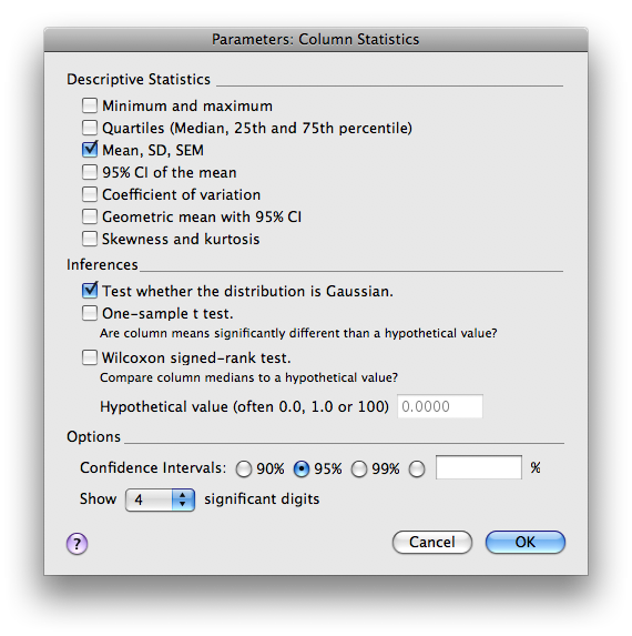
From the data table, choose >ANALYZE>Statistical Analysis>Column Statistics.
Select the particular statistics you want calculated. Click OK.
One-way ANOVA
Description: A one-way ANOVA compares the means (or medians, if nonparametric) of three or more groups that differ on only one dimension (independent variable). The test determines if there is a significant main effect of that variable. In order to determine which groups differ, you must perform post-hoc t-tests.
Table setup:
Format of data table:
X Column: None.
Y Column: A single column of values OR, means +/- SEM (or SD), n. Remember, you can select the “Change” button to alter the format.
OR
Type of graph:
- Select the “One grouping variable” tab.
- Select the middle graph in the top row (Column bar, vertical).
Analysis setup:
- Once data are entered, click on the “Analyze” button.
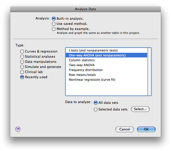
Under Analysis select “Built-in analysis.” (In the graph below, ANOVA is one of the recently used tests. Thus, we can find it in that category as well.)
Under Type select “Statistical analyses.”
- Select “One-way ANOVA (and nonparametric).”
Under Data to analyze select “All data sets.” Click OK.
Next you will be prompted with an Analysis Parameters box.
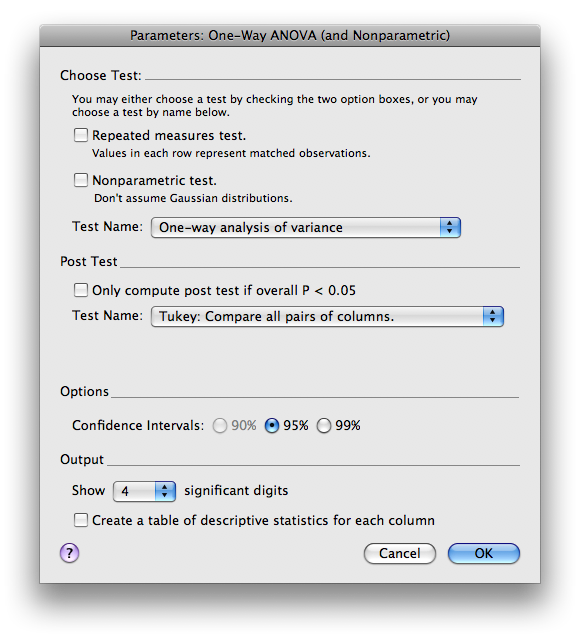
Normally you will use the default selections under Choose Test, but if you are performing a repeated measures test or if the data is not Gaussian, be sure to check the appropriate boxes. If you want post-hoc t-tests, select the appropriate choice under Post test (the Tukey or Bonferroni post-hoc tests are used most often).
Click OK.
Results:
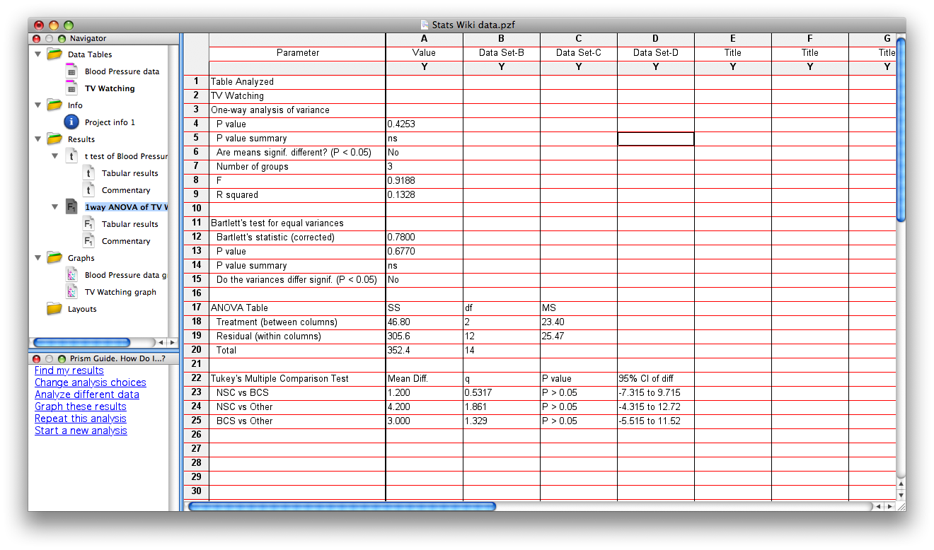
You should now see the tabular results (shown below) of the analysis selected. This window describes which data table was analyzed, what type of analysis was run, and the results of that analysis. Note that for the data on TV watching given in the Wiki, the overall F=.9188 and df = 2,12 (df for treatment=2, df for residual=12). The p = .4253, therefore there is no significant main effect of academic major on # TV hours watched per week. Also reported in this table are the results of Bartlett’s test, which evaluates whether there are significant differences in variance across groups (if there are, nonparametric statistics should be used – use the CHANGE tab to select a different test). The results of the posthoc tests are reported at the bottom of this page. In the present example, there are none of the posthoc comparisons are statistically significant.
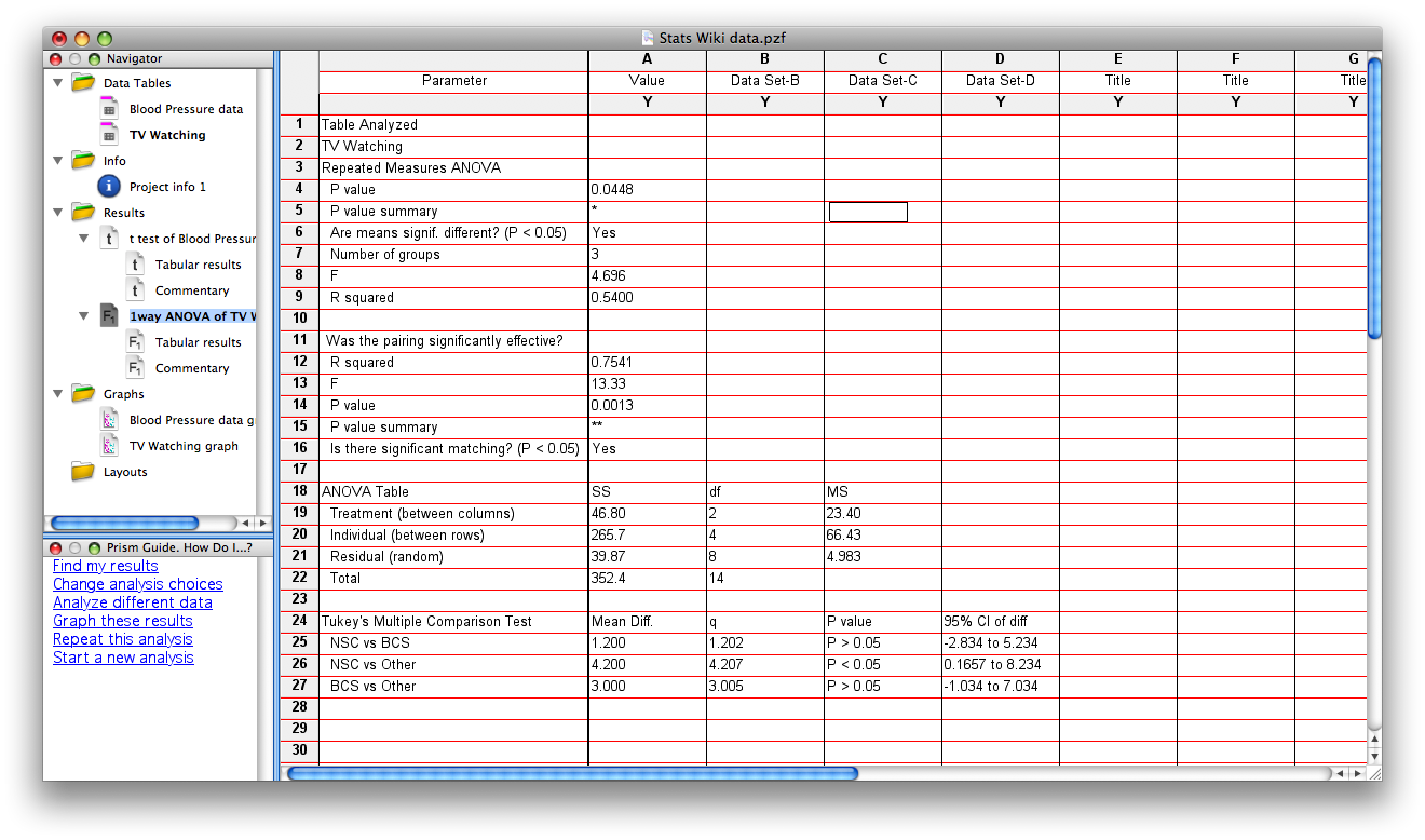
NOTE: If you realize that repeated measures ANOVA should have been used, this is easily corrected. Be sure you’re in the Analysis window; click on CHANGE. The Analysis Parameters box will reopen, and you can select repeated measures. The results window will now specify that the statistics reported are for a RM ANOVA. If you do this for the TV watching data, the results will now yield F=4.696, df = 2, 8 (df for treatment=2, df for residual = 8). The p=.0448, suggesting that a significant amount of the variance in the data can be accounted for by academic major. Posthoc t-tests reveal that NSC majors watch significantly more hours of TV/week than do “Other” (nonBCS/nonNSC) majors. Again, notice that the pairing (repeated measures) had a major effect on the outcome of this analysis.
Exporting Data/Graphs from Prism
Prism saves files in the .pzf format, which is meaningless to anything but Prism
There are several ways to get your files to a readable format elsewhere
Click on a data table or results tab, go to FileàExport to export the data as a .txt file
Click on a graph, go to FileàExport to export the graph image as a PDF or TIF or other image format
- Highlight the data you want and copy it into word or excel
- From any graph, copy and then paste into another document
- On macs, use command-shift-4 to take a screen shot. This turns your mouse into a cross hair. Click and drag to create a box around the area you want to capture, then release to take the shot. The image should appear on the desktop as a .png file, which is readable by most programs. If you capture your stats in this way, you won’t be able to edit them, but you can see the values you need.

